|
Talking About Art: click here to view list of topics Last year I went to see the Willem de Kooning exhibit at the Museum of Modern Art. I was quite smitten with a small drawing–it was pencil on vellum–and wanted to try this medium myself. I love the luscious texture of the surface, and the possibility of infinite tonality. Drawing with a simple graphite pencil is so satisfying!
There are technical and stylistic differences between my oil paintings and watercolors. Oils are done on canvas, watercolors on paper; oils dry permanently, watercolors can be dissolved; oils use white pigment, watercolor’s only white is the paper.
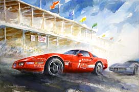
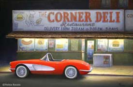
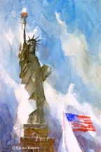
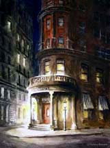
Stylistically, depending on the subject, my watercolors tend to be more atmospheric than my oils. A good example is when I paint cars. The watercolor, left, has a looser treatment than the oil, right. In the watercolor, I am looking for the spirit of the scene, in the oil, I can emphasize the car’s sculptural precision.
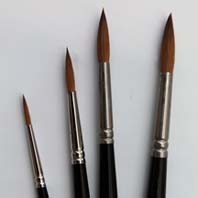
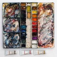
For watercolor painting, the better the materials, the better the working experience. Fighting poor quality brushes, colors and paper is very discouraging. Paper should have a good surface with just the right amount of sizing–enough for the colors to remain bright and not sink in. Paint should be pure pigment and medium, with no fillers. Brushes need to be springy and able to hold a goodly amount of water. (BTW, to test a pointed brush, dip in water and vigorously rap it once against your finger. This shakes out the water and reveals the quality of the point.) I’ve settled on Arches watercolor paper with a rough surface. It takes color nicely. There are other good papers as well, and it is worth a bit of experimentation to find them. The pigments I use are by Winsor Newton, their top line. These are good colors and always consistent. While I try out different brands of brushes, I find that Winsor Newton’s Series 7 sable brushes are still the best. The tips of sable brushes wear out as they are worked over rough paper, but that is the nature of the best, it seems.
When faced with a fresh, pristine, most likely expensive, piece of watercolor paper, the first brushstroke of color, no matter how pale, seems like the darkest tone possible, for the contrast is extreme. But as the paint creeps across the paper, it quickly becomes apparent that darkness cannot be achieved, for the whole watercolor gets to looking rather limpid. But there must be contrast, so when painting a night scene, I build darks layer upon layer, leaving, of course, the areas of light totally devoid of paint, so the contrast remains stark. At the end, I modify the light areas very carefully, to bridge the gap between dark and light. It can be tricky.
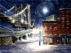
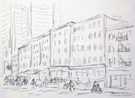
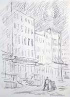
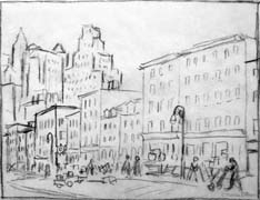
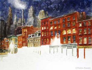
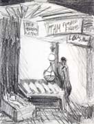
Step-by-step: Special Order Watercolor Commission I just completed a custom watercolor for Maavani and Bejan, who live at the South Street Seaport. They wanted a view of their building on Front Street, a block of recently restored nineteenth century buildings mixed in with a few new structures designed to complement the historic district. I visited the site and sketched three possible views: looking downtown toward Beekman Street (below left), looking squarely at the middle of the block (below center), looking uptown toward Peck Slip (below right).
Bejan and Maanavi selected the left composition as the starting point, and we discussed the character of the scene. A key element was the powerful sense of history at the Seaport. They wanted the street to look as it did in the past, with old storefronts, no trucks or cars, and with the activity of the Fulton Fish Market. Maavani and Bejan: Bring back the charm of the fish market and take us back to that period of time. Also, Maanavi did not like the modern skyscrapers that today loom behind the small buildings. I suggested replacing them with older tall buildings, some still standing, but no longer in view. Bejan and Maanavi agreed, and also said they liked the idea of a night scene, as in composition number three. The next two sketches expand on the sketch selected, with differing placement and size relationships.
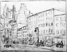
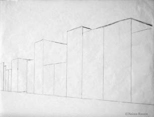
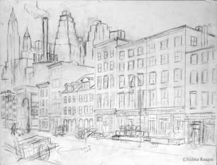
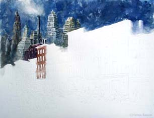
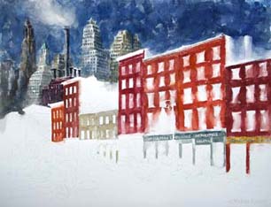
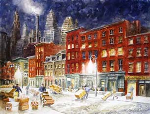
The next step was to develop the full-size sketch, 18 inches high by 24 inches wide. I started with a simple line layout (below left), then developed forms and added detail (below right). In addition to my own sketches and photos from fish market days, I researched architectural details from half a century ago at New York City’s Municipal Archives. I wanted to substitute older buildings for new ones on Front Street, and to find out what structures of bygone eras were supplanted by the current crop of sleek skyscrapers. I even found a power plant (now long gong) with wonderful tall smokestacks.
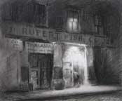
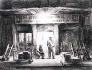
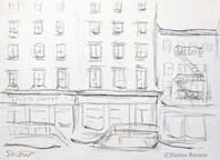
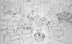
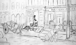
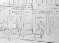
Starting at the left of the composition, I included Carmine’s Bar & Grill (corner of Beekman and Front), with its iconic ship’s wheel sign, and, to the right: Finest Fillet Company, Timmins Cooperage housed in two low buildings with dormers, shellfish wholesaler Joseph Sturges & Son, Milligan & Higgins Corporation (gelatin manufacturers), and Knickerbocker Ice Company. These represent a step back in time of roughly half a century. Today, Carmine's is vacant, and Il Brigante Trattoria Pizzeria, Mobile de Angelis (Italian interior design showroom), Bin No. 220 Restaurant, Jack's Coffee, and Made Fresh Daily (breakfast and lunch cafe) have replaced the rest. Maanavi and Bejan liked the round baskets that were used for clams by the fishmongers, and also seafood boxes with fish tails sticking out. I added these elements, as well as journeymen pushing hand trucks (see details below).
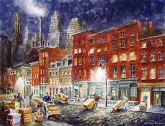
Now to build color! I established the background first, the better able to key the reds of the brick buildings to the deep blue night sky. I used a layered approach to developing the rich colors of this scene. Foreground activity was painted last. There was a lot of detail to manage, which always comes together slowly. I don’t like to rush things, and besides, at this point the watercolor seems to have its own schedule, which to ignore is folly.
The importance of drawing as a foundation for any art form cannot be underestimated. It allows me to think on paper. It is a silent dialogue with the scene in front of me, a continuous loop of observing, drawing, evaluating. It can be a way to understanding the subject, and know its essence. I collect impressions and images to use later for creating finished work in the studio, or jot down possible compositions. And sometimes, with a few lines, I snatch a fleeting moment of life, just to have it. Once it is in my sketchbook, it can transport me back to the scene any time. All my paintings start with drawings.
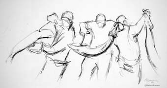
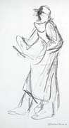
The sketches below were done in the Fulton Fish Market. Just a few lines capture the action, or lack thereof. The man reading a newspaper is perched gingerly atop boxes of fish he hopes to sell when the action picks up. In the sketch with three figures, it was the swing of fish in transit that caught me. The single figure, far right, grips a fish's tail with one hand and its head with the other. It is clearly heavy, as he seems to totter with it.
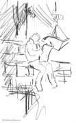
The life drawing class I'm attending at the Art Students League is in the same studio where, over four decades ago, I studied figure drawing and anatomy with Robert Beverly Hale. Little, if anything, has changed about the room. I may even be sitting on the very chair I once occupied as a student. With this perspective, thoughts about learning anatomy come to mind as I draw the model. I recall how important it was to know such things as one mastered drawing the figure. Now I wonder if I draw what I know, or draw what I see. After all, the forms I want to draw are in plain sight-the model stands before me. Aren't my own observations sufficient to yield truth of form? Knowing how something should be-well, perhaps it makes for formulaic drawing-a rendering of the ideal, instead of the actual. But then again, knowing bone structure, function, shape of muscles, what goes where-maybe this gives my drawing conviction. It certainly feels that way as I swing a piece of charcoal with gusto across the paper. My thoughts turn from anatomy studies to the particular model in front of me, drawing his particular bone structure, his muscles, his stance, his pose-which is far more interesting than any ideal could be. Oh, and by the way-the bone structure of his head is quite fabulous. I sketch on location and use my camera to record details. Sketching connects me to the subject, allowing me to learn about it and to decide how to portray it. These sketches evoke the scene as I develop a watercolor in my studio. I no longer do finished artwork on location. The tyranny of reality interferes with my thought process and the evolution of creative work. I prefer mulling things over and being deliberate, rather than hustling to paint something before the light changes. Once an idea gels, I make several thumbnail compositions (below left) to see which arrangement might be most effective.
Next come color notes, sometimes using pastel (top middle). For this particular watercolor, I can choose sunset, or rainy day colors. I then do a full-size sketch on tracing paper, and slip a piece of graphite transfer paper under it (above right) and trace the drawing onto watercolor paper. This serves as a guide. It doesn't do to figure out the horizon line or where objects are placed when paint is spreading out of control or worst, drying too soon. Any lines showing at the end are easily erased. Now for the color work (below, left to right). I use transparent watercolors, so the only white is that of the paper, not in any of the pigments. Once color meets paper, there is no turning back, no lightening, only darkening. Traditionally, one starts light and works toward deeper colors. However, I like to jump right in and establish my darker tones right off the bat. It sort of shocks me into high gear and the rest of the process becomes an adventure. In the light areas, however, adventure gives way to prudence, and I’m careful to use a delicate touch. I save the most intense darks for accents in the final phase of development, and the watercolor is finished.
I'd love to hear your comments and questions. Please click here to email me at SeaportArtist [at] gmail.com... Thanks, Naima |
|||||||||||||||||||||||||||||||||||||||||||||||||||||||||||||||||||||||||||||||||||||||||||||||||||||||||||||||||||||||||||||||||||||||||||||||||||||||||||||||||||||||||||||||||